Monday, 27 February 2012

Mark Power Exhibition.

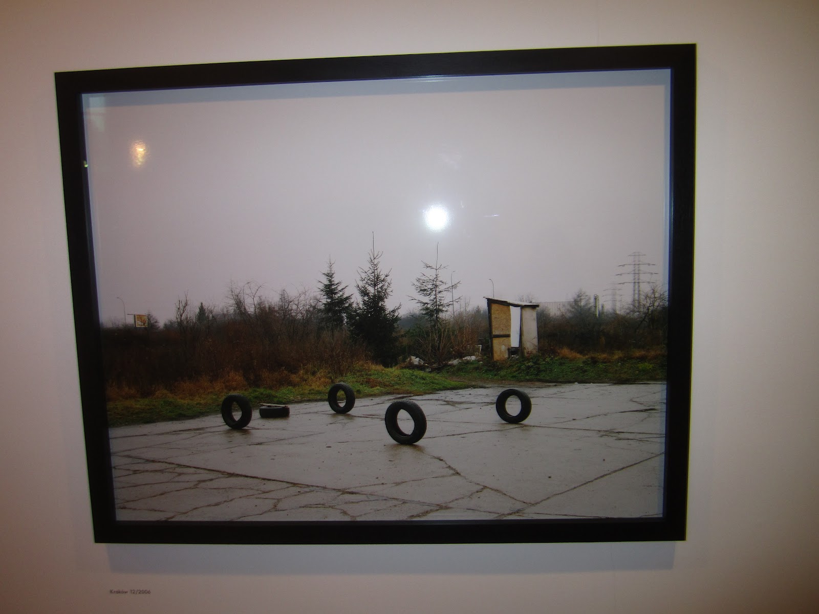
On Thursday 23rd February, I went to see an exhibition at Impressions Gallery by Mark Power, called The Sound of Two Songs.  The project, started in 2004, was made in Poland over 5 years.  I thought that the project showed two sides to Poland.  There were photos of a country that is starting to develop and become more 'Western', and there were also photos of a country that seemed very under developed.  The photos definitely had a contrast between the west and the east.


I liked the layout of the work, each image was separated by enough white space to let you look at each image without being distracted.  Also, the prints were very large, with lots of detail, which meant you could really study the photographs.  Some photographs had quite bland colours, which gave a run down feel, but other images had very vivid colours, which helped give the impression that the country was developing, with more western influences.

I really liked this exhibition, and will continue to look at Mark Powers work.

Saturday, 11 February 2012

Berlin...

Going to Berlin was a great (and very cold!) experience!  I had an excellent time, it was a good opportunity to get to know everyone more, especially the tutors and the second years.  Berlin is a very inspirational city, filled with history and culture, and there are photo opportunities around every corner.

We visited loads of galleries, including C/O Berlin, the Buchmann Galerie, The Guggenheim, Gallery Taik, The Helmut Newton Foundation, and various other independent galleries.


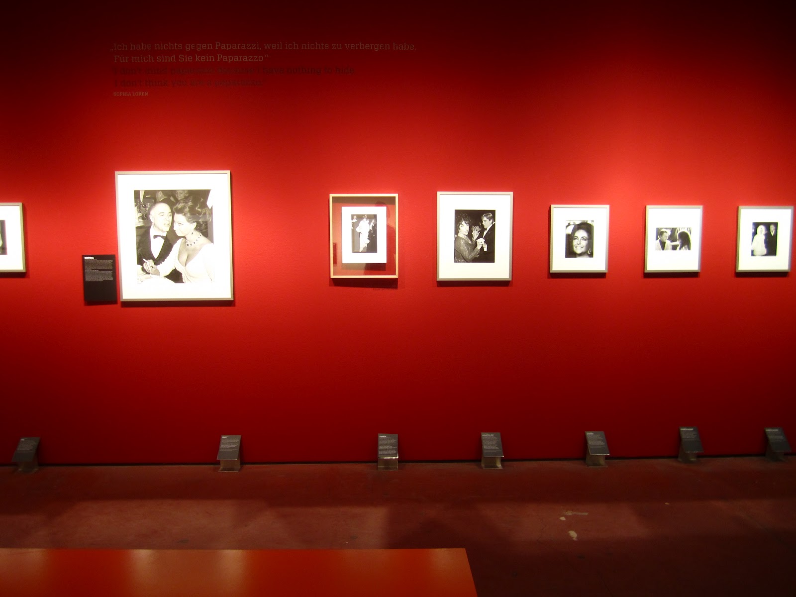
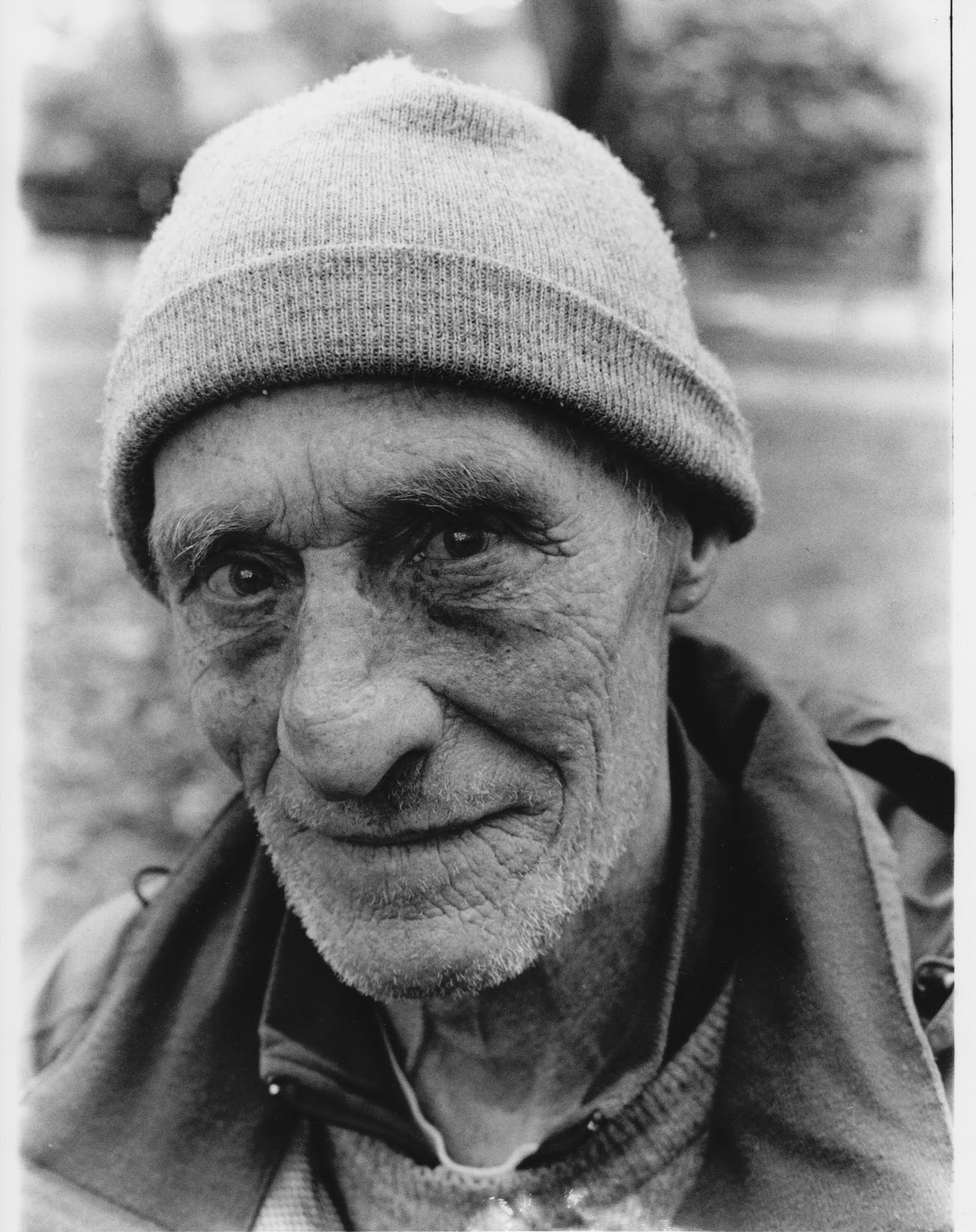
Above are some photos of the exhibitions at C/O Berlin.  There were two photographers being exhibited at C/O Berlin.  Ron Galella (top two photos), and Gundula Schulze Eldowy (bottom Photo).  Galella's work was very interesting.  Galella was a paparazzi photographer, photographing all of the celebrities of the 60's, 70's and 80's.  The exhibition was well presented, with the photographs mounted in nice frames, and text that explained some of the images.  There was even a video explaining a law suit that was filled against Galella for 'Stalking' someone.
There were two parts to Eldowy's exhibition.  The first part was documenting the contrast of Berlin during and after the war.  It was interesting to see children playing in the rubble, and people going about their daily lives without any thought to the carnage around them.  The second part of the exhibition I wasn't keen on.  This part of the exhibition was on life, birth and death.  The photographer had been in a slaughter house, and taken photos of severed cows heads, pigs bodies etc.  He had also been to a hospital and photographed births that had gone wrong, which wasn't pleasant to look at.


The next gallery we visited was Gallery Taik.  This gallery had an exhibition of a student of the Helsinki School.  The artist was trying to communicate the idea that when a certain emotion is triggered/felt, you remember or associate it with a memory that links with that emotion.  I liked the way in which the works were shown.  The space itself was small, which meant that not many photographs could be hung on the wall, but i think that this worked quite well.  As you can see from the photos above, the photos were hung quite far away from each other.  This helps the viewer to look at each photograph individually, rather than getting distracted by the photo next to it. 


The next Gallery that we looked at was exhibiting the work of Adam Magyar - Underworld. Magyar had photographed subway systems and train carriages.  if you looked closely, you could see individual people.  It was interesting to see people lost in their own world, travelling on the subway.  The photographs showed little else apart from the train carriages, which helped you focus on the details of each carriage.


The next gallery that we visited was the Helmut Newton Foundation.  This was a fantastic gallery.  The exhibitions were housed in a very elaborate building, with a huge staircase, very high ceilings.  There was an exhibition of his personal items, clothes, cameras, posters, and even a set up of one of his rooms in his house.  Also, there were huge prints that must have been over 2 meters tall on the wall over the staircase.  The exhibition upstairs was based on his works on Polaroids.  The main prints were enlargements of the original Polaroids, and there were some of what looked like the original Polaroids in a glass cabinet.  It was amazing to think that these Polaroids were what actually came out of the camera, and that Newton would have actually held these Polaroids in his hands!  The work was nicely presented, with lots of space in-between each photograph, framed very well too.  Also, the gallery itself was clean and shiny, and spacious.


The last gallery that we went to was the Buchmann Galerie, which was exhibiting Joel Sternfeld's Campagna Romana.  These works were based on the juxtaposition of Roman ruins of a powerful civilisation of the past, and our modern day society.  The works were very well presented, with a nice white border around the edges that helped set the prints off from the frame.  Some of the works were set out as diptychs and triptychs. I thought that this worked really well, as you could look at the image as a whole, as well as each individual component.  


Adrian took us to an amazing book shop that was filled with big glossy books and magazines.  There were books from every photographer that I could think of, all of which I wanted to buy, but I had to restrict my self to the books in the sale unfortunately!  I still ended up buying three books though!

Overall, I thoroughly enjoyed the trip, it was such an amazing experience, And I would love to go back again, and see more of the city.

Friday, 16 December 2011

The Sartorialist....


In my last PPP1 session we were told to look at a blog that we found/followed, and explain what we liked about it.  I looked at a blog called The Sartorialist.  The Sartorialist is a photography centred around fashion and street photography.  The author, Scott Schuman, walks the streets of NYC and other major cities looking for people that catch his eye.  The blog has a very simplistic design, which makes it easy to concentrate on the content of the blog.  At the side of the page, there are related posts, and the blogs archive of posts.  There are very little words in the posts, but I don't think this matters as the photos speak for themselves.

Overall, I like the simplicity of the blog, and the content.  The layout makes it very easy to navigate around.

Thursday, 1 December 2011

One Day Brief - Flash Fiction.

Today we were set a one day brief.  We picked at random a piece of flash fiction; a story with a specific word count.  We then had to create 5 images that would accompany and help illustrate the text.  This was then presented at the end of the day in a 6 slide powerpoint.  At first I was unsure about the brief, but as it progressed, I found myself enjoying it more and more.  Here are the images and the text:

Nathan was finally asleep after hours of restlessness.  Thoughts and dreams filled his head.  After only a few minutes his phone rang.  He jumped out his of skin.  Abusive language threatened him and frightened him.  He was all alone.  


Monday, 28 November 2011

Visiting Speaker - Caroline Molloy.

Today we had Caroline Molloy give a lecture about herself and her work.  Caroline works as a professional portrait photographer.  She has worked for Glamour magazine, Marie Clare, Good House Keeping, Prima, and many others.  Caroline didn't have enough time to go into more detail about her commercial work, which was a shame, as I would have liked to hear more about it.  Caroline has worked on a few personal projects, such as Age 20 Isreal 95, Troubled thoughts, and a project on identical twins, which I forget the name of.

Age 20 Isreal 95 was a project about the Isreali army.  The Isreali army conscripts both men and women, and Caroline chose to focus on the women in the army.  Caroline spoke of a feeling of 'family', and that the women feel that they have to serve for their family.

Troubled thoughts was a project on the troubles in Ireland.  Caroline is a Catholic, and although she wasn't affected directly by the troubles, she wanted to document how it affected others, and tell their stories.  Caroline used still images as well as moving images in her project, and used the transcript from the video as an art piece in its own right.

The identical twins project started as a result of Caroline starting to notice twins everywhere.  When she started photographing the twins, she didn't know what the project would become, and didn't know what direction she would take with it.  This project would eventually help to get commissions for commercial work.

Thursday, 24 November 2011

...

Following my introduction to 5x4 cameras, I have swiftly come to the conclusion that it is imperative to my survival that I acquire one.  That is all.

Wednesday, 2 November 2011

First Test Shoot....

Today I had my first test shoot.  After getting my times mixed up (again), I finally managed to rent two Flash Heads, stands, soft boxes and a Beauty dish.  I think the shoot went well, I have the image that I am going to use for the digital Visualisation for the interim crit.  I was clear on my idea; I wanted to use cross lighting, with one light, and a black background.  I also had a pretty good idea of how I wanted the subject to be.

First, I used a long rectangular soft box, positioned vertically, to the right of the subject.


This is the setup for the above photo.

It took a few tries to get the light in the right place to get a highlight in both eyes.  I like the shadows on the face, but wanted to try and lessen the shadow on the chin.


  Next I tried using a square soft box, to see what the difference would be.  Here is the result.  


This is the setup for the above photo.  

As you can see, there is less light spilling vertically from the soft box, which allowed me to concentrate the light more on the subjects face.  however, because the light is more concentrated, it gives harsher shadows on the fee, which I did not want.  


I finally settled on the beauty dish. 


This is the setup for the above photo.  

 The beauty dish gives a much wider spread of light, which gives softer shadows (By soft, I mean the transition of light to dark).  I still need to work on the composition and position of the light, as well as the amount of light from the flash.  

Overall, I think todays shoot was successful, I am now more clear on my idea, and how I should go about shooting it.  

Tuesday, 25 October 2011

PP1, Lecture 2, Social Media Success

Today's lecture was about the success of social media, and how it has now become an essential part of professional and personal life.  One thing that I picked up on, was that networks make things work; many aspects of networks. Networks of friends and family, water and sewage system networks, business networks, and many others.  Social network sites link people, and it is very important to be aware of the difference between personal and professional when using the sites.  Innapropriate content on a Facebook page could be taken in the wrong way.  This could be the difference between gaining and losing a client.

PPP1, Lecture 1, Who are you?

This first lecture was on the topic, 'Who are you?'.  We looked at personality archetypes and personality traits and how they work for and against us in the professional work place.  The personality archetypes work by you selecting one word from four different lists, each with two words each.  These words then form a four letter sequence, that has an explanation.  My sequence was ISFJ, which means I am quiet, friendly, responsible and conscientious.  I agree with this to an extent, but I think that some of the other categories apply to me too.

We also looked at personality mapping.  This is where you rate certain aspects of your life out of 100, and then draw these figures on a graph, and it comes out looking like a spiders web.  This can be done regularly, so you can see how you and your personality changes over a period of time.

Thursday, 20 October 2011

Ways of Looking.

Today, group B and I went to Bradford, to visit the Ways of Looking photography exhibition.  One of the exhibitions halls we went to, was the Impressions Gallery, where I was told Martin Parr had his first exhibition, while the gallery was based in York, before the gallery moved to Bradford.

The first exhibition we went to was in the Pop Up space, next to Costa.  The work that caught my eye the most was that of Rob Ball.  His striking prints were of pacemakers that had been taken out of the bodies they powered before cremation.  This sounds grim I know but they had been cleaned up before they were photographed.


Ball created the series after working as a Forensic photographer, and it shows.  The meticulous attention to detail really comes through in the prints.  Each pacemaker is photographed on a white background, and in the centre of the frame.  The white helps to the visitor to focus on the pacemaker and in details.  Also, there is no meaningful text under each photograph, only the serial number of each pacemaker, which means that the viewer has to come to their own conclusion of the context of the photographs.  The prints do not have a frame which makes them seem to blend into the walls.  This makes the pacemakers look even smaller.


The next Gallery we went to was the Impression Gallery, where we were shown round by a fine art graduate called India.


This exhibition was created by Jeremy Deller.  He produced the exhibition from an archive of photos from a photography studio called The Belle Vue Studio in Bradford, and the photos are from the 50's to 70's.  The photos document the large number of immigrants arriving from Asia and the Caribbean at that time.  Deller used these photographs to explore the cultural and political heritage of Britain.  

All of the images are studio based, and the sitters are wearing smart suits that were provided by the studio, along with other props.  The sitters would then send the photo home, to show how good their new lives were.  The photos are framed with a creamy-white surround, with a black frame.  The photos looked dwarfed against the wall and frame, but this draws you in to look closely at the prints, and I like this idea.  


We were then shown around an exhibition of Red Saunders' work by India.  All of the photos are representations of historical events.  The photographs are subjective, trying to tell you something about the event that they are depicting.  The images have been shot in a way that makes them look like paintings, with the lighting highlighting different parts of the image that help to tell the story.  All of the images are staged, on sets and complicated lighting set ups.  


The photos have been printed very large, and are shown on a deep red background.  This is a reference to the great halls in old houses that had rooms to show the big paintings.  The walls were painted really rich, deep colours to set the paintings off.  

Overall, I enjoyed looking around all of the exhibitions, there were some interesting photos which gave me some ideas for my briefs.  


Also, here is a picture of Sam looking happy in the sunshine, in his sunglasses.

Tuesday, 18 October 2011

Layers, Blending Modes, Quick selection....


In Monday's Digital Imaging session, we learned how to use layers, blending modes, and the quick selection tools.  Here is an image of Brendan, my flatmate, which I shot a while ago, overlaid with an image of cracked mud.  I brought the image of cracked mud in as a new layer.  My aim was to create a double exposure effect.  I reduced the opacity of the new layer a little, and used a layer mask.  With a low opacity brush, masked in his eyes a little more, to make them stand out.  Its not as good as I would like, so I will have another go at it soon.  

Friday, 14 October 2011

First day in Vernon Street darkroom...

Today group B had our induction in the darkroom.  We learned the process of developing film, getting the film onto the spool in the tank, mixing the correct amount of developer and water, keeping it at 20 degrees etc.  We then made contact sheets, cutting the negatives up into strips of 6 frames, and putting them into the glass negative holder.

We then learnt the chemical process of developing the photographic paper.  90 seconds in the developer, 30 seconds in the stop bath; being careful not to put the tongs from the developer into the stop bath, then back into the developer.  Then the paper goes into the fixer for 5 minutes, and then throughout the magic hole in the wall, into the wash baths for 20 mins.


This is the contact sheet that I produced.  It enabled me to see the images that I had taken, and decide which ones I want to print.  

This is the test strip for the two print below.  The lightest section is a 5 second exposure, and the sections increase in exposure by 5.  This is always a good idea to do, as it helps you to work out the exposure time for the final print.  

This is the first print that I made.. The exposure settings for this were f/2.8, 18 seconds, grade 3.  I am very pleased the overall print, apart from the minor blemishes on it (caused by chemical residue on my fingers, oops!), but when I looked at it in the daylight, I thought it looked flat in regards to tones and contrast.  

 This is the second and final print that I did.  The exposure for this print were f/2.8, 18 seconds, grade 4.5.    I much prefer this print, as it is much more contrasty (and more contrasty on my screen).  I am really happy with this print, but I may print it again, just to get it perfect :)

Sunday, 9 October 2011

Workshop

On friday group B had a workshop in the studio, looking at different lighting arrangements.  We looked at broad lighting, short lighting, butterfly lighting and some others too.  We then had the afternoon to set up the lights, and try them arrangements out ourselves.

This is an example of broad lighting.  We used a shoot through umbrella for this shot.   

This is an example of short lighting.  This was using a beauty dish.   

This is an example of cross lighting, which was also using a beauty dish.  

Light Night

It was Light Night here in Leeds on friday, so my flatmates and I went into the city centre to see what we could find.  Light Night is a big event/exhibition where actors, poets, musicians and artists share their work with the city.  There were events all over the city, in the college, the libraries, the Electric Press building and more.  


The 2 photos above are from the exhibition in the College cafe.  


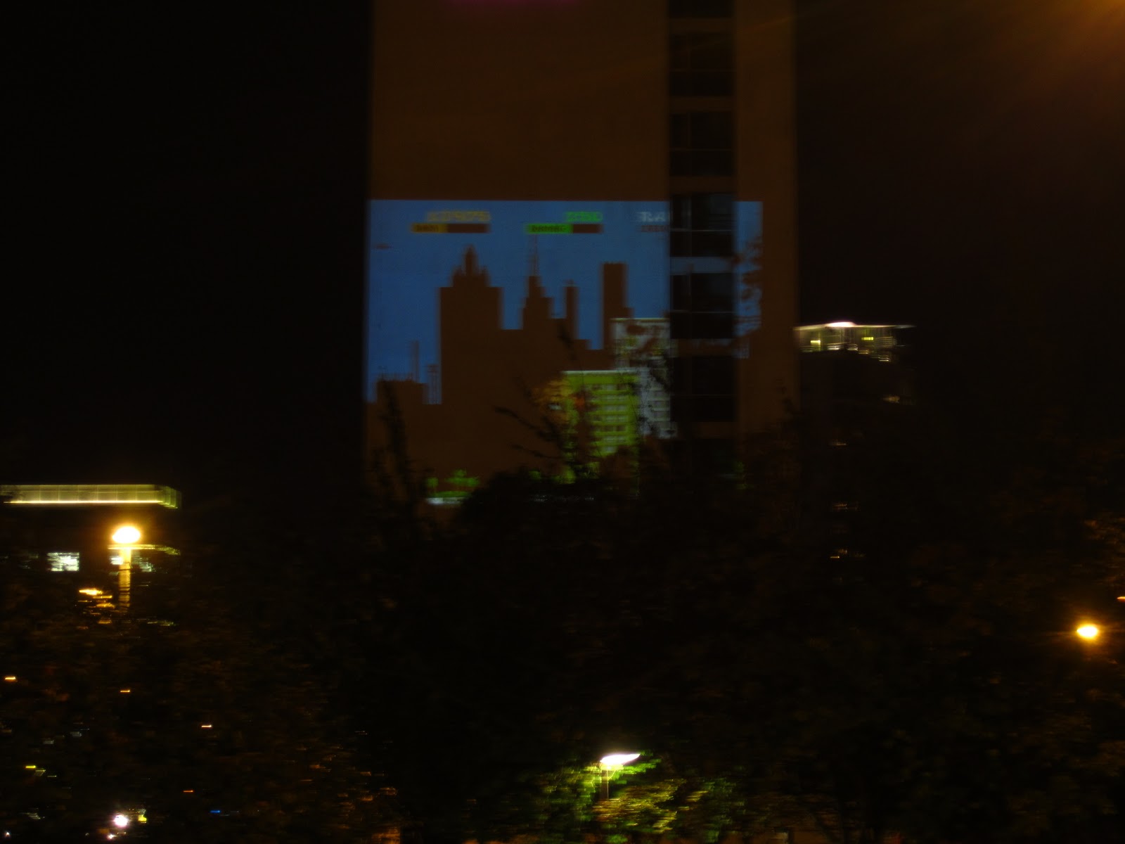
As we walked into town, we saw these projections of games on the sides of the city buildings.  We found the projectors, and there were kids actually playing the games!